Park & PayRedesign
Park & Pay
Redesign
Role
Full Stack Designer
Full Time
Status
In Progress
Currently in Development
Duration
October 2025
2 weeks
01
Overview & Problems
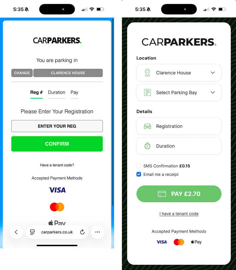
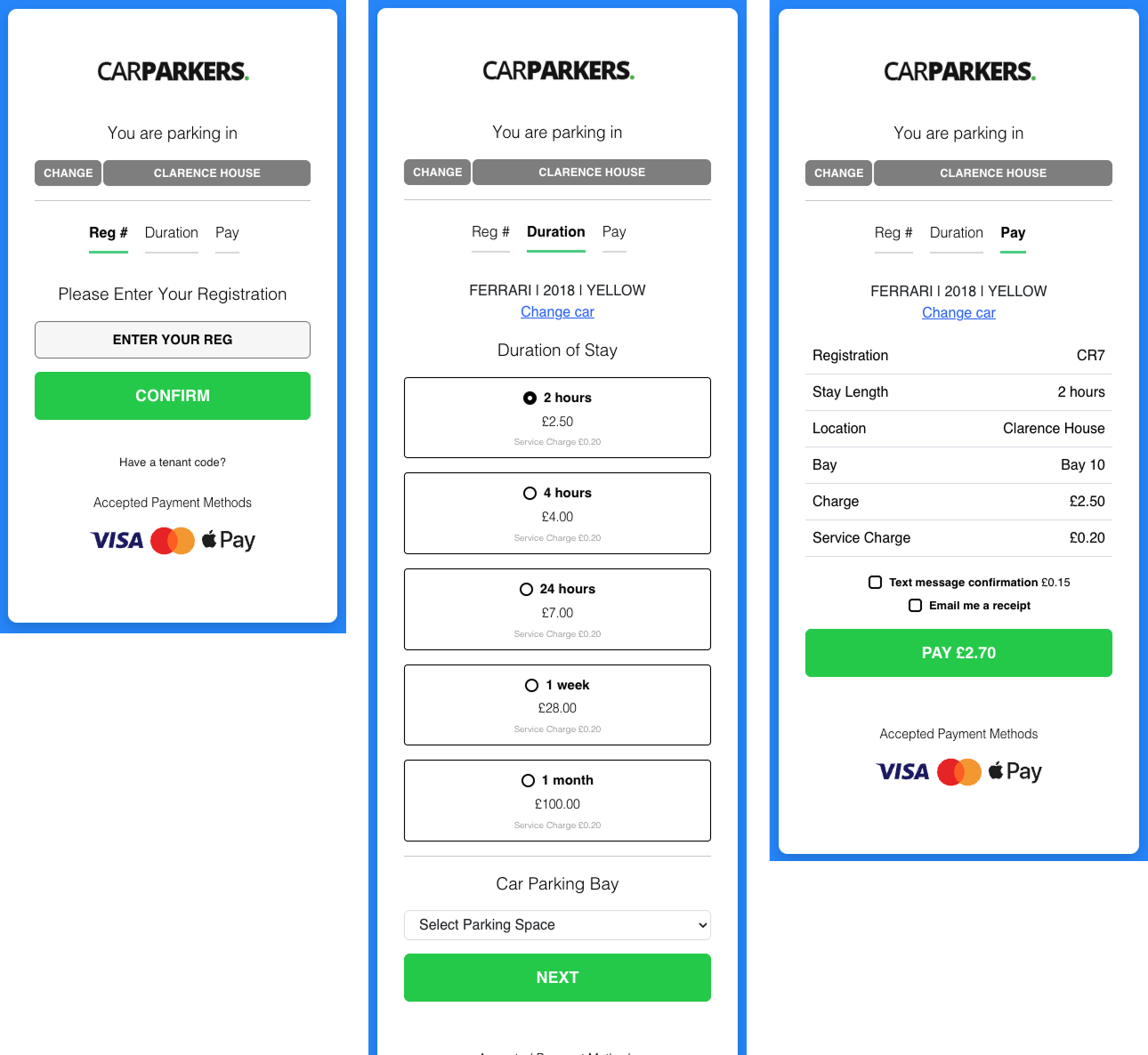
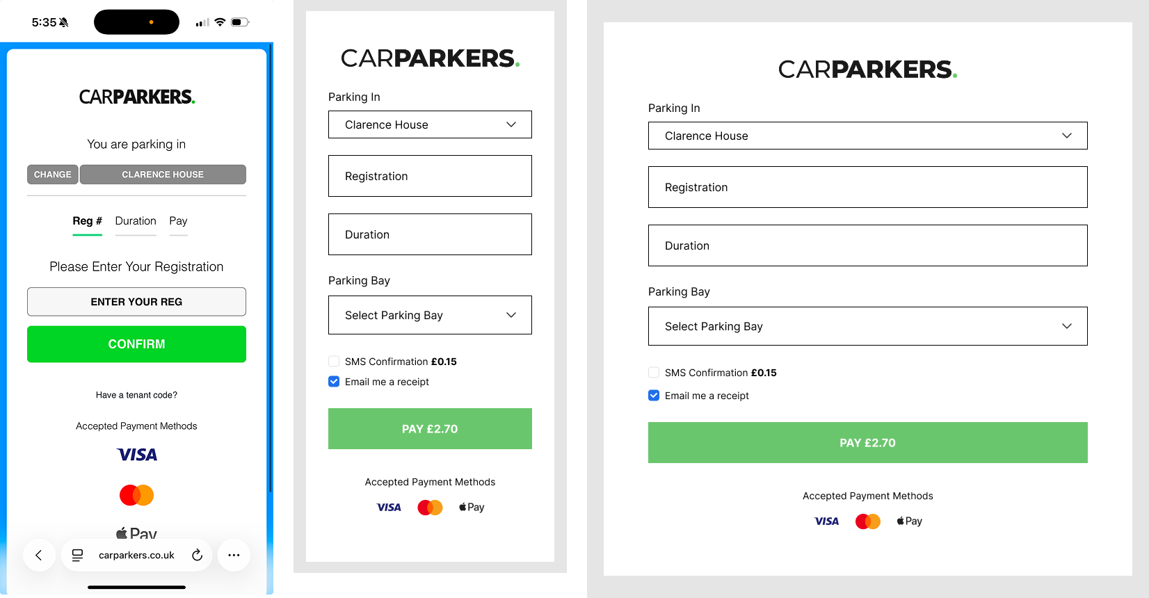
The existing CarParkers Park & Pay system consists of a mobile-friendly page that spans across 3 steps, namely Registration, Duration, and Payment. I felt that this could've been simplified to become a 1-page layout for the most frictionless user experience.
There was also a slight issue with the lack of consistent branding and general UI discrepancies such as differing border radiuses and alignments.
There was also a slight issue with the lack of consistent branding and general UI discrepancies such as differing border radiuses and alignments.
02
Planning & Wireframe
When planning out the wireframe, one thing I had to take into consideration was that the existing version had 3 separate URLs for each step. This meant different sets of information would be sent off and received with each URL change.
One thing I spent a longer time deciphering was the fact that inputting a registration number would fire off a back-end request to pull through vehicle information. This resulted in a larger amount of information (Make, Date, Color) that was challenging to display on a single page.
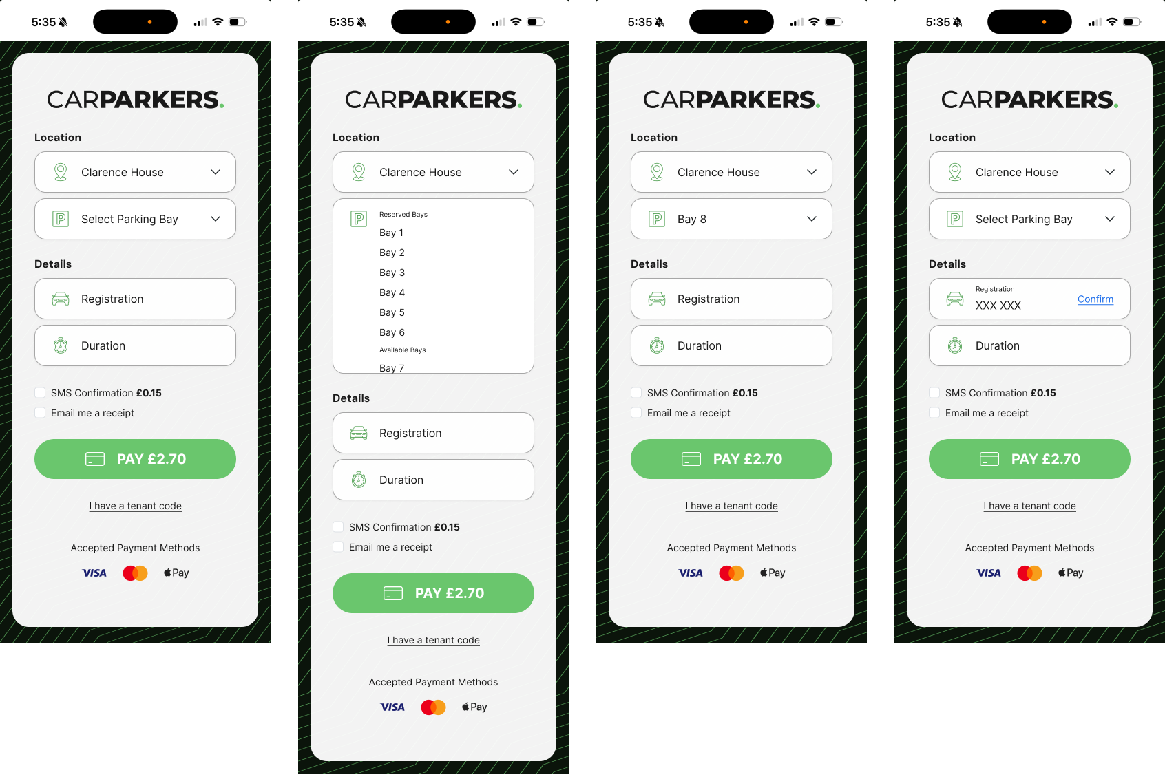
To combat this, I had a discussion with one of our developers and proposed a few possible solutions, to which we landed on an in-line 'Confirm' field that would fire off the request upon inputting vehicle registration, which wouldn't involved additional fields.
03
Development & Design
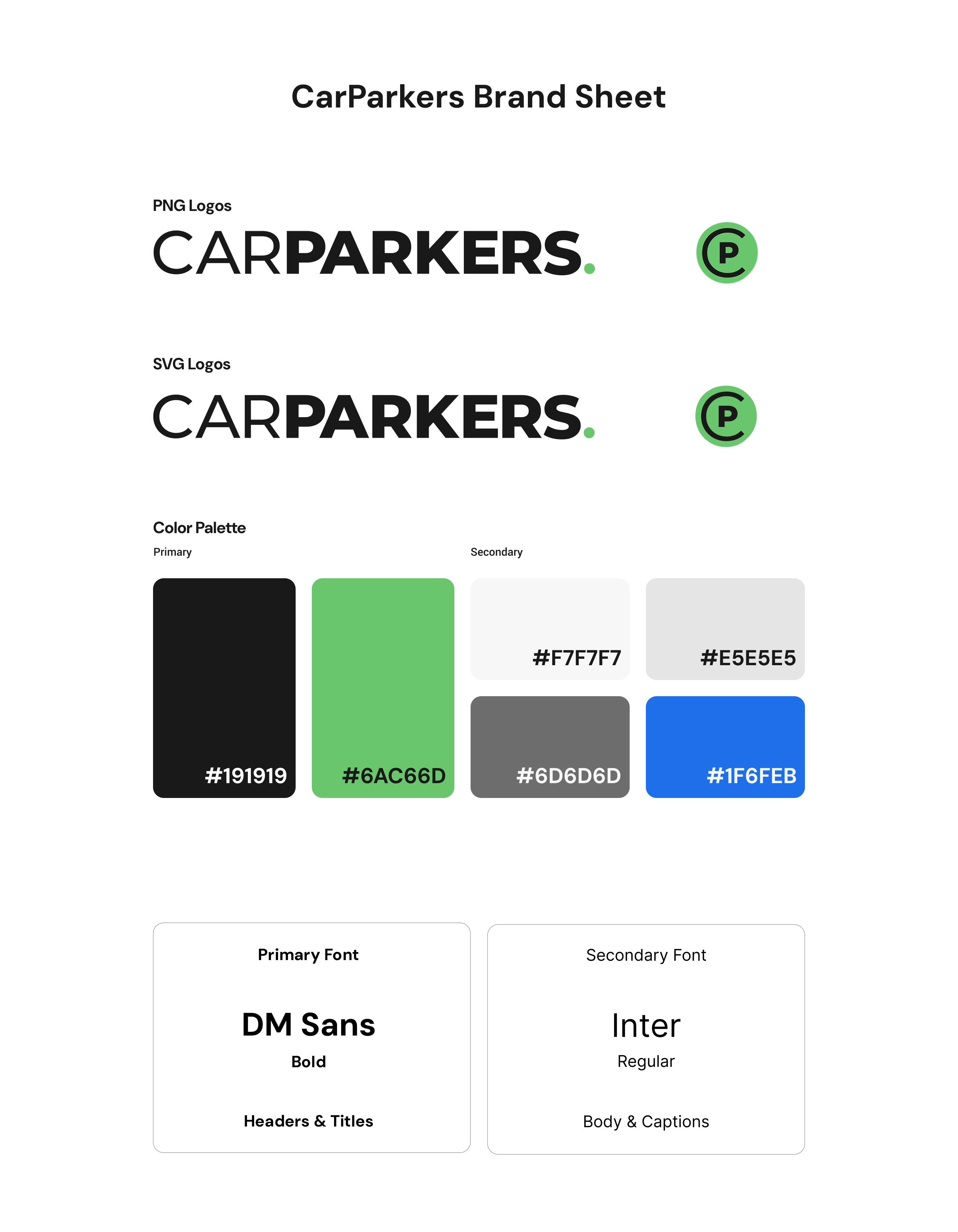
Alongside the Park & Pay flow, I also designed a brand sheet that we would use moving forward to ensure consistency across all touch points. This included a circular icon that could scale as both a favicon and an app icon, to account for the potential to scale in that direction.
I managed to reduce the number of pages from 3 to 1, accounting for the information request firing mentioned in the planning stage, and applied this same logic to the Tenant Code input fields.
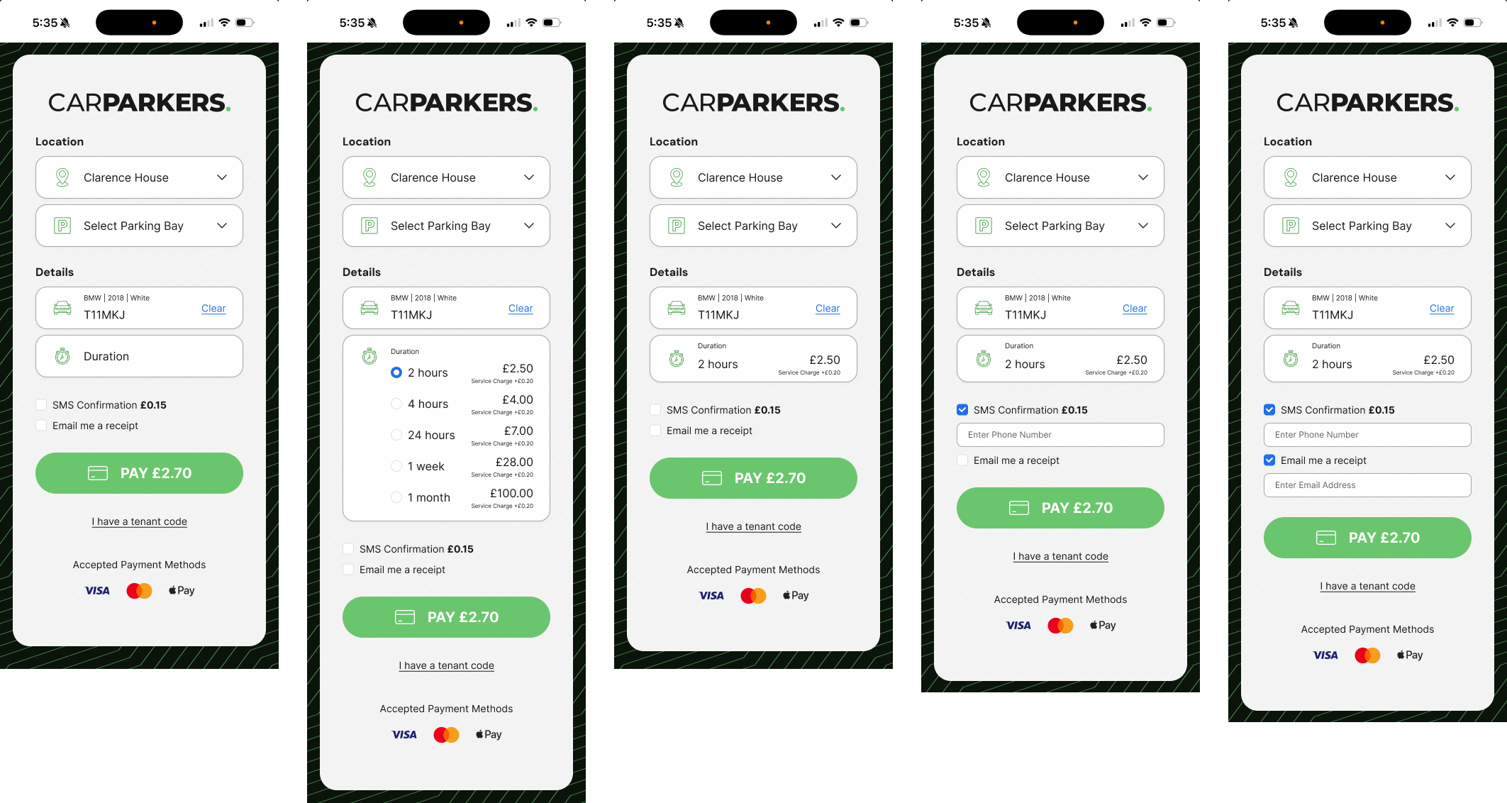
In the end, I ran feasibility tests with my working prototype with every member of my team, collecting feedback for iterations along the way. We decided at this point that it would make the most sense to group the fields into Location, and Parking Details. My working prototype and flow chart are linked below.
FinalDeliverables
Final
Deliverables
This new design is currently in development.
Below is a working prototype, and this is the current Park & Pay system.
04
Results & Learnings
As this project is currently in development, we don't currently have results yet. However, one of the learnings from this project was how important it was to get input from my team in building the best possible product.
I enjoyed this project immensely because I love the challenge of simplifying steps and making a SaaS as user-friendly and seamless as possible.
I enjoyed this project immensely because I love the challenge of simplifying steps and making a SaaS as user-friendly and seamless as possible.
OtherProjects
Other
Projects
Years of experience
2
Projects Completed
10
+
Industries served
3
Clients satisfied
1
0
0
%
.png)
